v4 Box
Allows for content to be placed in highlighted colored boxes to highlight or separate content. Paragraph is made from two sections, Box and Box Items. Boxes will display 3 wide and then wrap downwards. Boxes will expand to fill the space available.
In Hydraulic v5, CTA Grid and Block Link closely resemble this component.
- Section Title (required) - Enter a short title to give to the paragraph
- Published (optional) - Select or unselect to make paragraph visible or not to site visitors. Defaults to published
- Show Link Button (optional) - Select or unselect to display the link for each box
- Columns (required) - Select the number of columns (1-4) to use before wrapping items
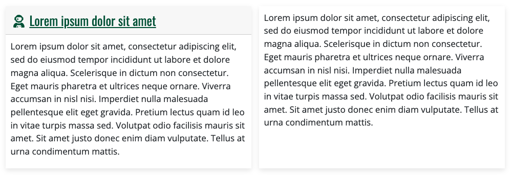
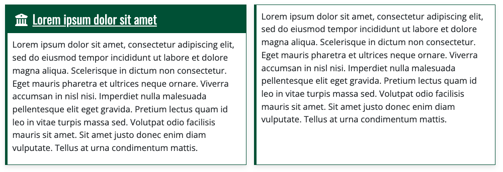
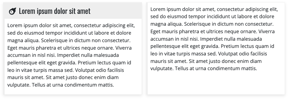
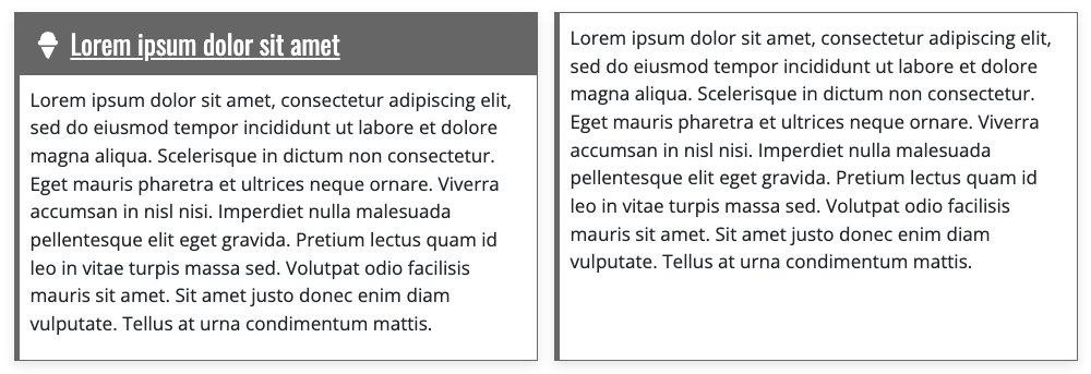
- Color (required) - Choose the colors to use when displaying the component
- None
- Green
- Gold
- Gray-Light
- Gray-Dark
- Item (required)
- Published (optional) - Select or unselect to make paragraph visible or not to site visitors. Defaults to published
- Title - Give the box a title that will help identify the component. This also doubles as an anchor link for the section when using the Current Page Section Menu on Basic Pages
- Body - Short description that helps further explain the section
- Media (optional)
- Icon - Ability to add an icon for the box
- Image - Ability to add an image for the box
- Additional Options (optional)
- URL / Link text - Identify where the button should take visitors and what the button should say
Instructions start on the Create or Edit Page within a piece of content.
- Create Content using the Add Paragraph button
- Choose Box from the list of Component in the Box section
OR
Edit Content using the Edit button - (optional) Section Title allows for a title to be given to the entire section
- Switch the Published field on or off for the component to be published or unpublished
- (required) Enter the number of Columns (1-4) that should be displayed before a new row.
- (required) Choose the Color of the boxes for the component
- None, Green, Gold, Light Gray, Dark Gray
Item
- Switch the Published field on or off for the component to be published or unpublished
- (optional) Set a Title for the Box
- Give the Body some word to display inside the Box
Media (optional)
- Set an Icon which will show up alongside the Title
- Image is not used
Additional Options (optional)
- Link fields will create a green button link to another piece of content, internal or external to the site.
- Click Add Item to add more items
- Repeat steps 8-13 until desired number of Items has been reached
- Return to step 2 to add more or edit existing Paragraphs
- Click Save