Form Embed
Have you ever had a form added to a page and thought "This could look better." Well now you can add an image or description to forms built within Drupal.
This is a custom component created for the Hydraulic platform and is not currently available in the university WordPress offering.
This feature allows the addition of an image or description added to the left while the form shows on the right. An alternative version allows for a description to be added above the form. As this component only works with Drupal Webforms, your site will have to have at least one custom Webform built for use on the site. In order to discuss the use of webforms on the site and have one built, please reach out to the OneIT - Student Affairs Support Web Development Team.
- Published - Select or unselect to make component visible or not to site visitors. Defaults to published
- Background Color (required) - Choose the colors which to use when displaying the component
- White, Black, Gray
- Body Placement (required)
- Body on Top of Form
- Body on Left of Form
- Section Header (optional)
- Include in Jump Links Menu - Select or unselect to make section title an anchor link
- Section Title - Give the section a title that will help identify the component. This also doubles as an anchor link for the section when using the Current Page Section Menu on Basic Pages
- Description - Short description that helps further explain the section
- Button Color - Color of the CTA button (green, gold)
- Button Link URL / Text - Identify where the button should take visitors and what the button should say
- Image (optional) - Choose an image from the Media Library
- Body (optional) - Text that will be displayed above or on the left of the form
- Webform (required) - Select a webform which you would like to display on the page
- Webform Settings (optional)
- Status - Whether the form is Open, Closed, or Scheduled
- Open - Set when the form should open automatically (must be before closed or empty)
- Closed - Set when the form should close automatically (must be after open or empty)
Instructions start on the Create or Edit within a piece of content.
- Create Content using the Add Component button
- Choose Form Embed from the list of Components in the Other section
OR
Edit Form Embed content using the Edit button - Switch the Published field on or off for the component to be published or unpublished
- (required) Choose the Background Color for the component (white, black, gray)
- (required) Select where the Body Placement should be in relation to the form
- (Optional) Section Header allows for the creation of a Call to Action (CTA) to display above or to the left of the text component.
- Include in Jump Links Menu (defaults to yes)
- Section Title
- Description
- Button Color (green, gold)
- Button Link URL / Text
- (optional) Choose an Image from the media library to display
- (optional) Give the Body some content to display
- (required) Choose the Webform to display on the page
- (optional) Provide some Webform settings for how the webform status
- Choose if the webform Status should be Open, Closed, or Scheduled
- If Scheduled provide:
- Date and time when the webform should Open or leave blank (date and time must be before Close)
- Date and time when the webform should Close or leave blank (date and time must be after Open)
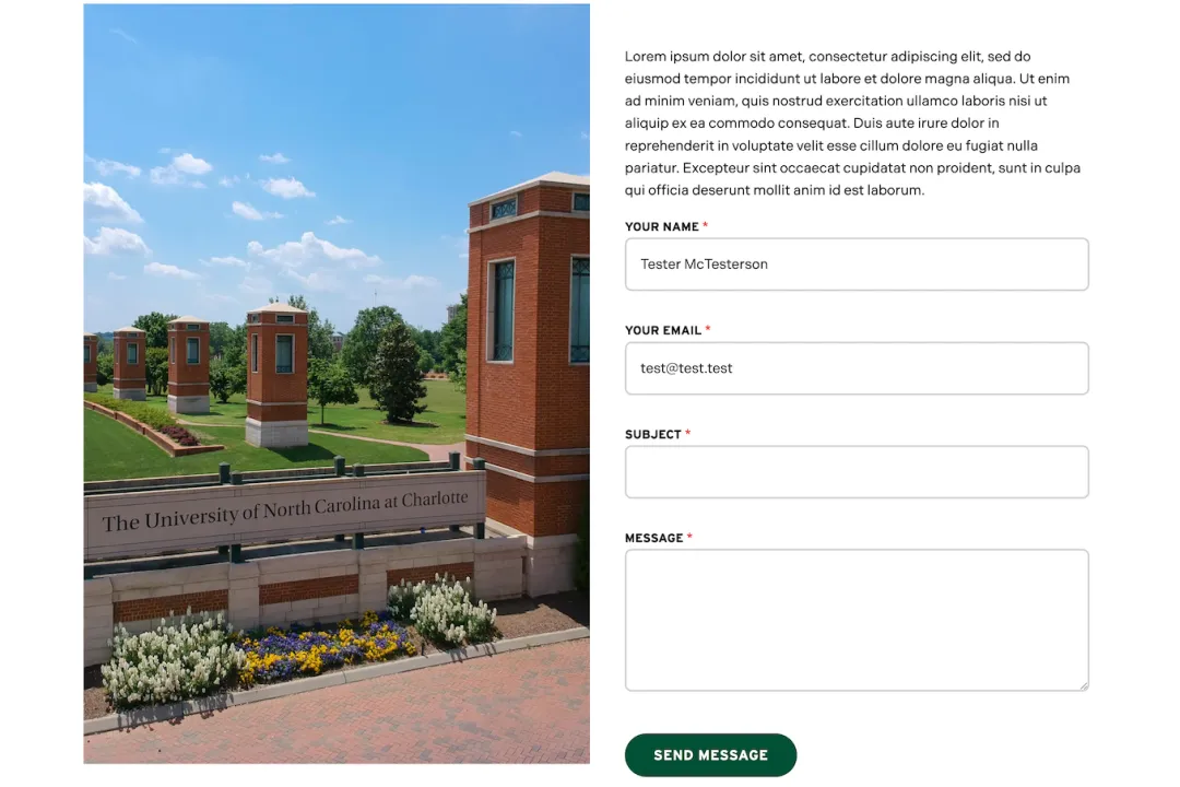
Example